Toontastic - Prototyping and Process
It started with a phone call from Thushan Amarasiriwardena outside of Mellow Mushroom in Raleigh sometime in the Spring of 2010.
I think.
Thushan and co-founder Andy Russell had formed a digital toy company called Launchpad Toys. Sounded pretty rad to me, so I jumped right in.
Preliminary Explorations - toontastic character development
Starting from scratch, we looked at a couple of various shapes and directions of how a character could be standardized and systematized.
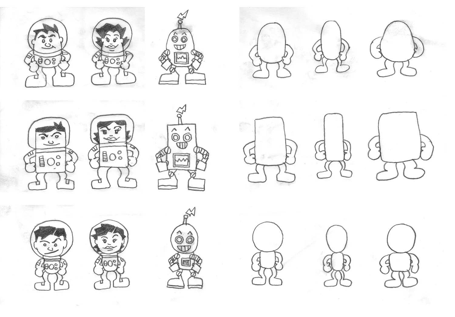
Various body types and their basic shapes when broken down.
After research involving children at a local museum, it was suggested that the more proportional third row was the best starting point for our character templates. Tough luck, egg people and square faces.
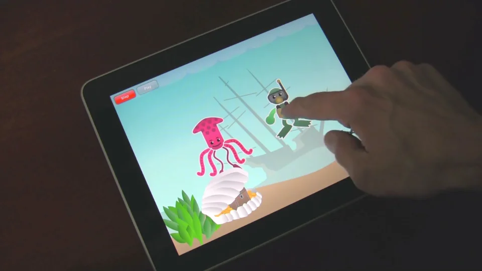
Prototyping - undersea adventure
Frogman
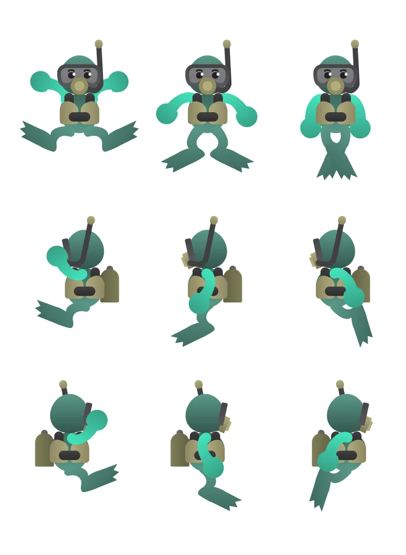
Frogman goes through a battery of motion tests.
Now a vector-based, gradient-shaded character, Frogman was the next evolutionary step from the initial character body types.
Mr. Squeeze
Our hero Frogman needed a friend (or foe?) to swim around with to test this prototype.
So Mr. Squeeze was born.
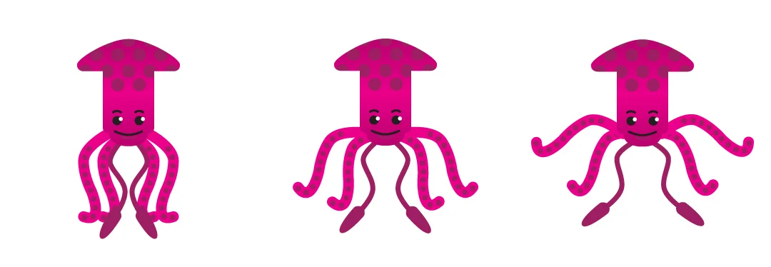
Dude just wants to hug.
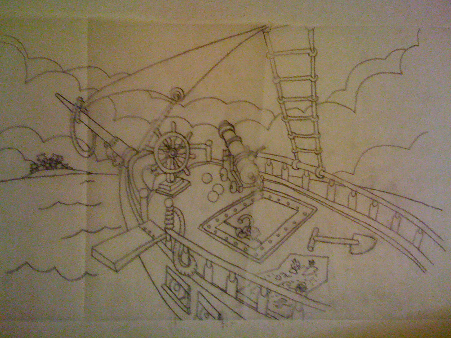
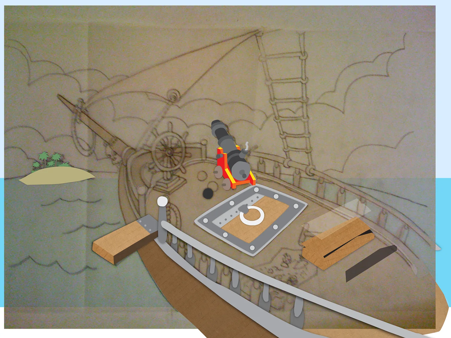
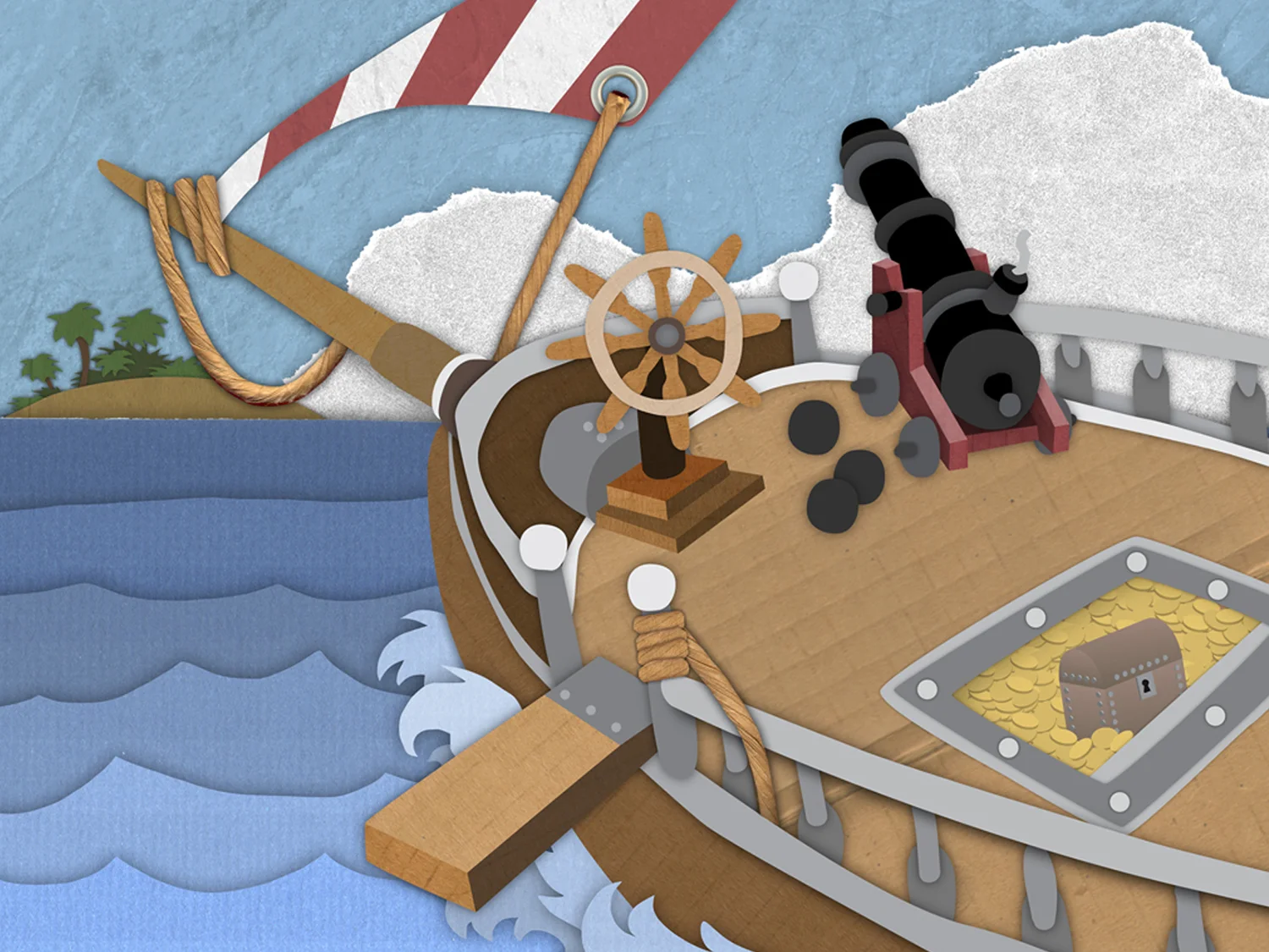
Davy Jones' Locker
Now the fellas needed a place to swim around in. Early on, it was thought that the environments would be full of motions, so a simple animation was created to test this idea.
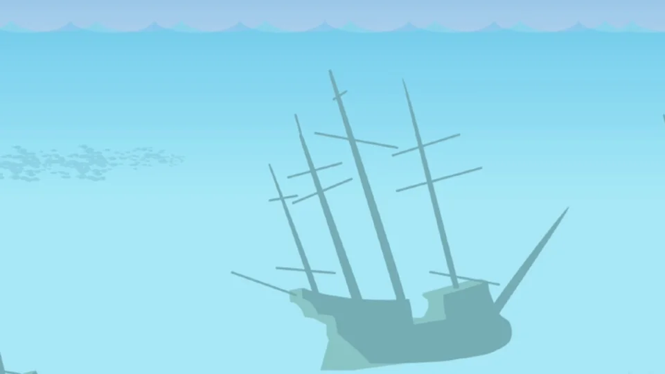
It turned out that it was too complex (at the time) so ambitions were scaled down, so the idea was shelved for a less memory-hogging flat background.
Anybody missing an anchor?
The prototype
The next phase - Toontastic begins to take shape
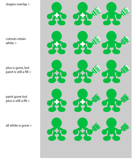
After initial testing of the prototype a couple of things became apparent.
- The characters needed to become a bit more flat when it came to coloring. Because of the limitations at the time, in order for a user to change the color, the characters needed delineated boundaries within their body architecture.
- The users found it easier to know what could be animated when the aesthetic was shifted slightly. So we went from a very soft character to a much more bold and almost "cut-out" figure style.
- Kids had a blast making cartoons and telling stories with Toontastic.
A tale of two Beardes
Yargh. D:<
We now had the frameworks of a system. So now it was time to build the first official Toontastic character.
Building on the template we had created, we thought about who exactly we should make first.
We needed someone who kids could grasp and hold on to, who would instantly rise to the ranks of a fan-favorite.
Someone who kids could identify with.
So of course he was a pirate captain.
Various iterations of Angry Bearde with shadow tests.
But it was decided that Captain Angry Bearde was just too angry. Why was he angry? Who knows. He doesn't really seem that upset about the leg thing. Or the missing eye. Or the fact that he's only got thumbs.
So the result was...
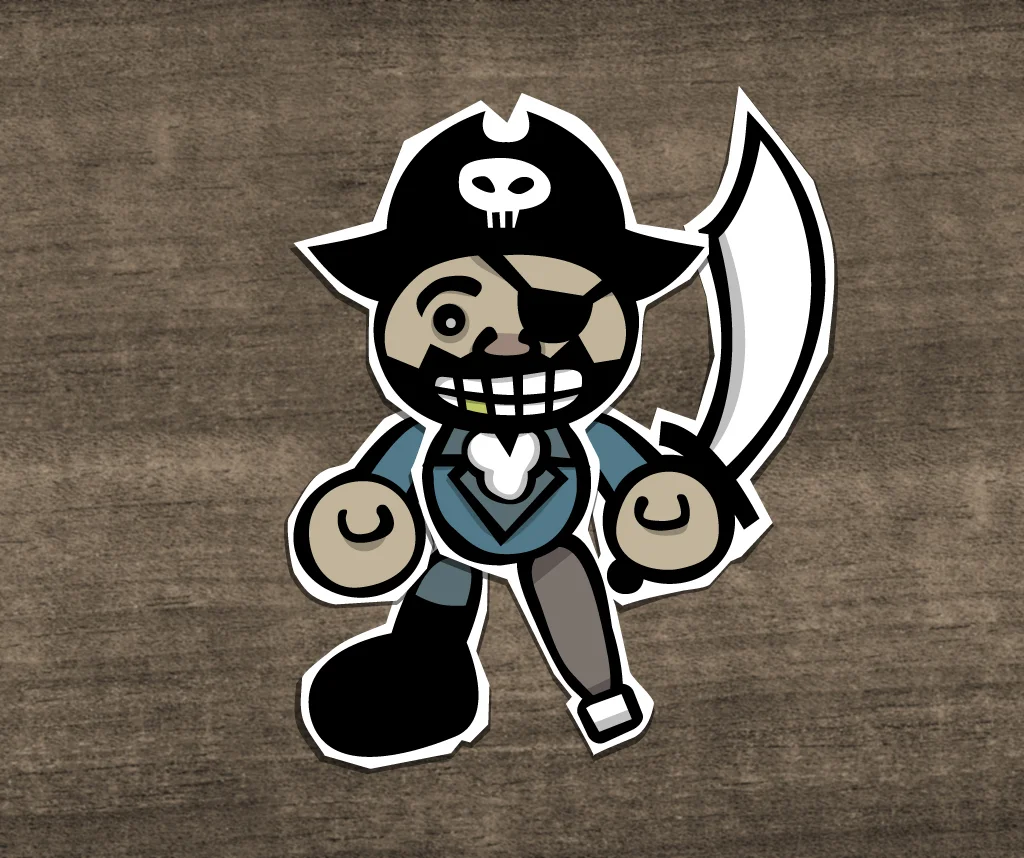
Yargh! :D
Captain Crazy Bearde. Man he just turned that smile upside down, didn't he?
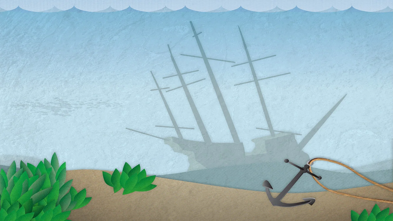
The further development of backgrounds
Cross-section of how most of the Toontastic environmental design was created.
We knew that if there was something that worked right out of the box, it was the first swings at the backgrounds. That was a question that didn't take long to answer.
We wanted it to look like it had been put together with pieces of fabric, cardboard, found paper and maybe even a little bit of glue. The basic recipe was:
texture mask
shape based on color layer (texture file placed + clipping path on copy of color layer)color layer (usually not treated)
shadow layer (if necessary)
color (usually black)
set to multiply (between 5%-50%)Gaussian blur (between 10px-30px)
But it didn't stop there. Pretty much anything you could scan or take a photo of might end up incorporated into a background. Concrete stairs became lunar landscapes, shopping bag cords became ship rigging, hubcaps became the designs within the spire of the Chrysler Building i New York City.
Sample background process - The Barnacle
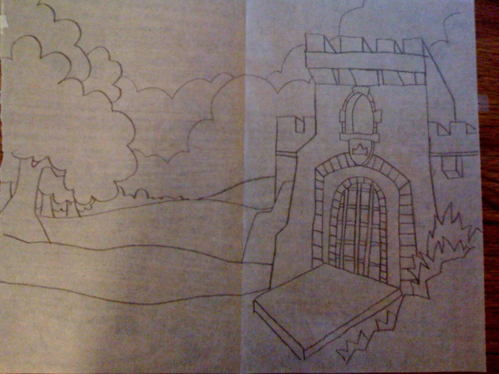
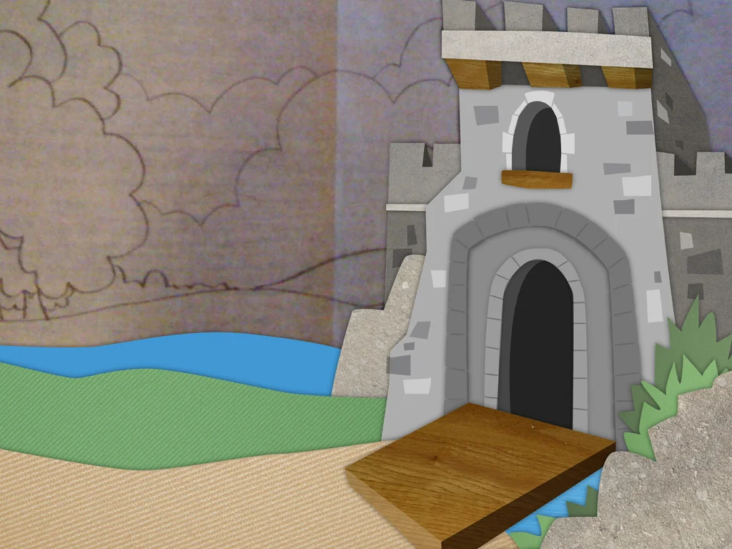
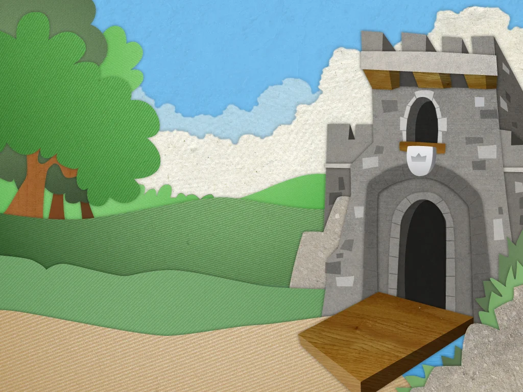
Sample background process - The Castle Gate
Additional assets - Exploration
Globe wrap
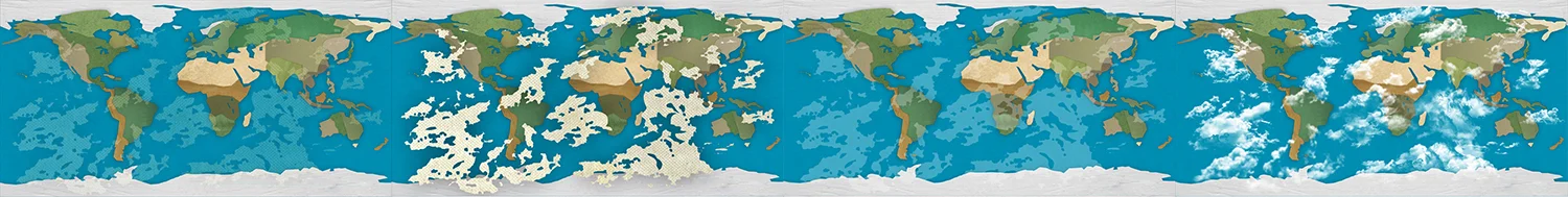
Examples in development of a world map that would track where all of the toons were being made around the planet.
Button icons
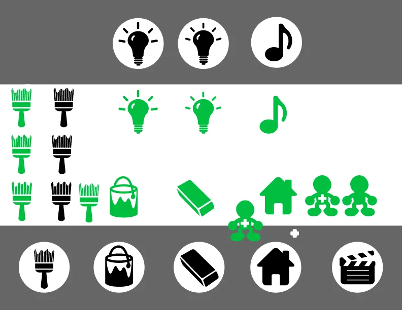
A set of button icons were needed to allow navigation through Toontastic. They needed to be easy enough for a very young demographic to understand.
Music Emoticons
A system of emoticons to aid in music selection was explored.
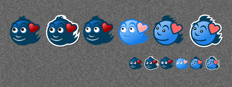
Are these ghost monsters from Pac-Man?
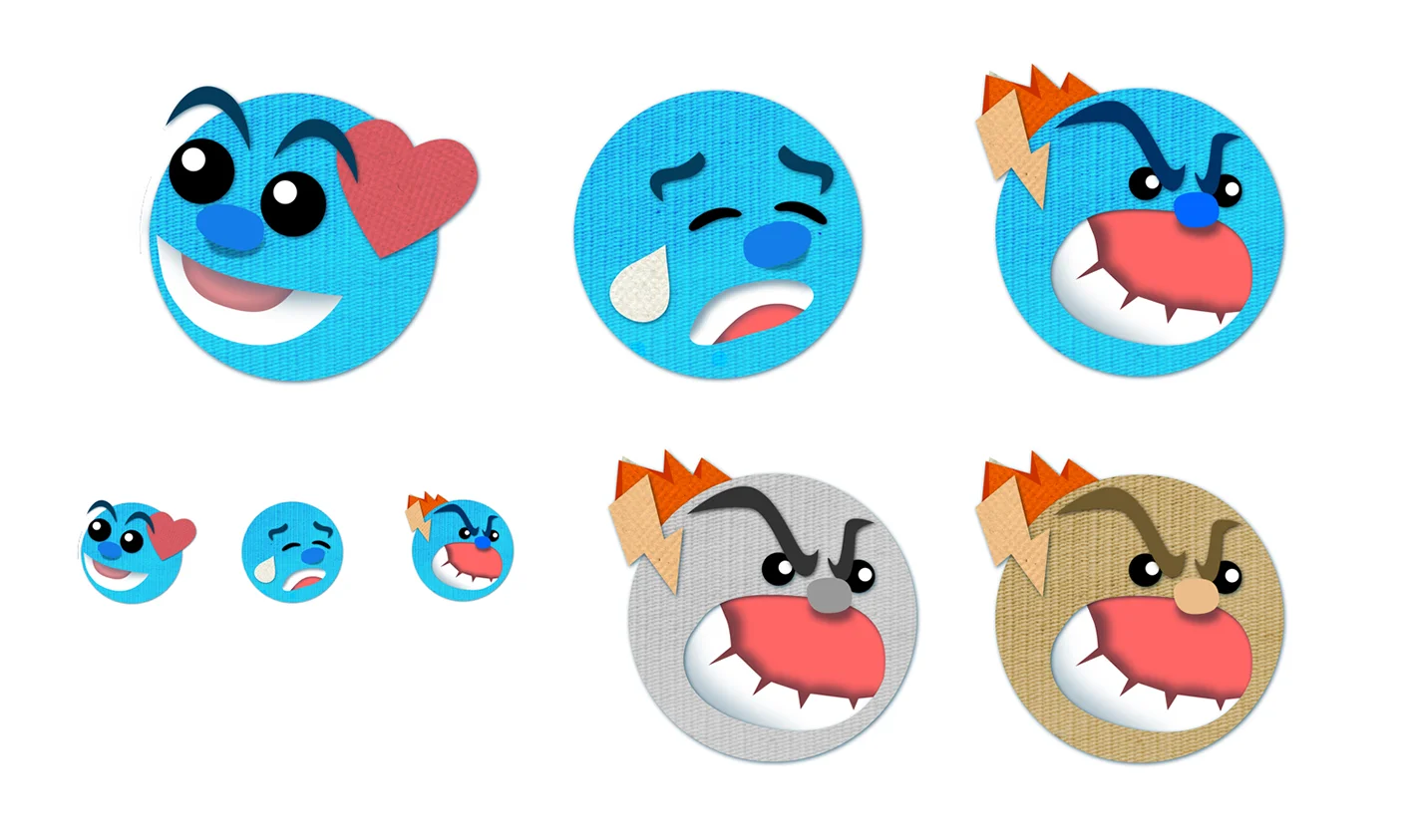
These guys are looking pretty good. Got a funny muppet feel to them.
They have the texture of some of the backgrounds and the emotions of some of the playable characters
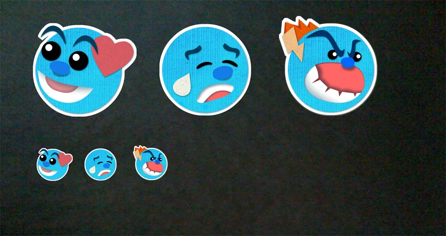
That's a nice next step.
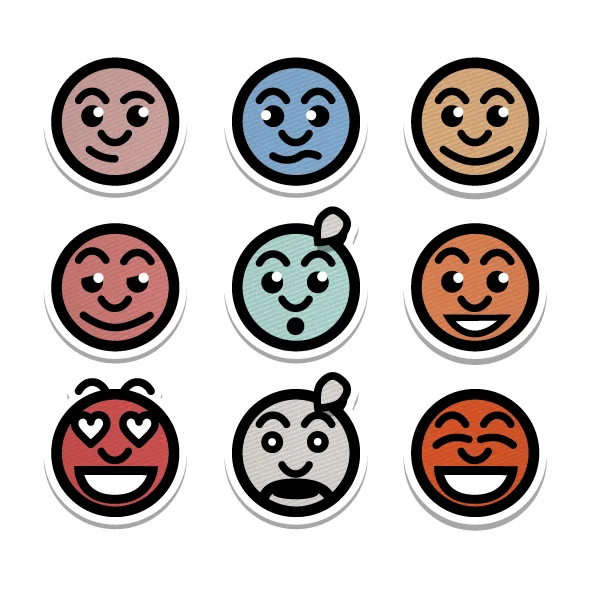
These guys were a little too flat, but their uniformity was nice.
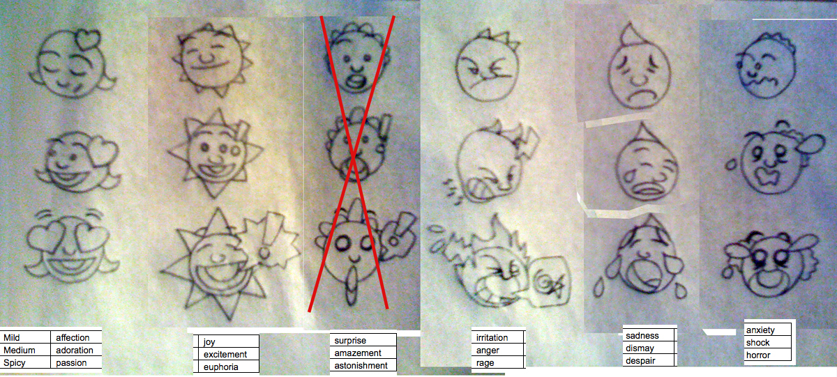
Time to extrapolate all of the emotions in the music choices.
Now we're cooking with gas!
Toontastic Logo
Once again, this was an aspect of the App that felt like it came together seamlessly, Using the cut-paper feel that was becoming the trademark of the program, the craft of the logo shaped itself into place.
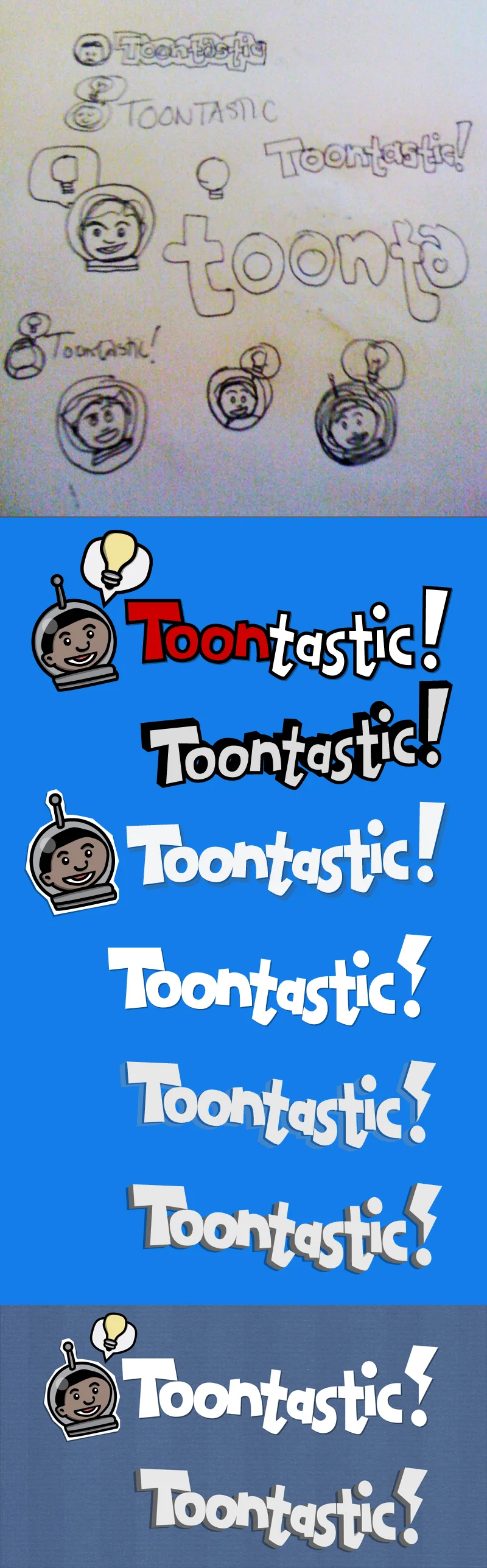
Nothing like a lightning bolt exclamation mark!
Toontastic - The First Run
The elements are coming together to form something that looks pretty dang close to what we see today.